

Trending colours for Autumn/Winter 17/18 is very interesting. It’s full of colours, there are different hues of yellows, blues and more. It’s full of warmth and maybe not expected for these seasons.
Flame Scarlet
This is a beautiful shade of red, it’s not too bright which is perfect for this season as people tend to wear dark colours so if you wanted to wear this colour you wouldn’t stand out so much.


Primrose Pink
This is a cute shade of pink, almost like baby pink. It looks great on it’s own just as well as a mixture of colours like in the image below. It creates a warm look as it is the lightest shade of red.


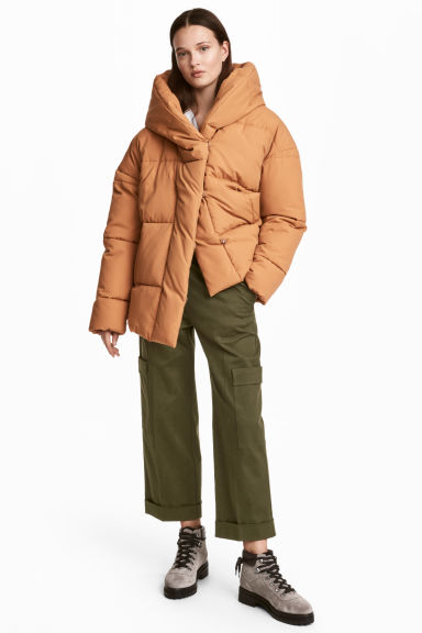
Toast
This is almost a neutral colour but you can tell there is tint of pink. It’s a great subtle colour, it goes with almost any colour you can think off.


Blue Bell
This just like primrose pink this is a nice shade of blue. It almost looks like the colour of the dress Cinderella wears. This is a nice colour to wear especially in the winter months for an icy look.


Royal Lilac
This is one of the colours I did not expect to see in for the trending colours of Autumn and Winter, but I can why. Royal lilac is like a dark shade of purple. The colour works for the seasons because its dark which means someone can add a pop of colour to their outfit without standing out from the crowd.


Otter
This colour is great because you can wear this with all other colours. It has a colder tone so it’s perfect for the Winter months but the brown colour reminds you of the bare trees in Autumn.


Navy Peony
This is a classic colour to wear if not much darker during these seasons. The garment below is an example of the use of this colour. It doesn’t always have to be an opaque garment for a colour payoff.


Copper Tan
This is an interesting one as it looks almost like a coral colour, which is usually associated with the Spring/Summer season. This is much less vibrant but can easily be pulled off like a nude colour.

Lemon Curry
I absolutely love this colour. Unlike the rest of the colours this colour does stand out. I would say this colour is hard to match with other colours without it clashing against each other.


Golden Olive
I feel like every year a different shade of green is on trend. This green has a warmer tone to it. I would say this is a good transition colour from Summer to Autumn.


